Sinister 7 Ultra Marathon - Branding
Logo Design, Brand Identity, Brand Development & Guidelines
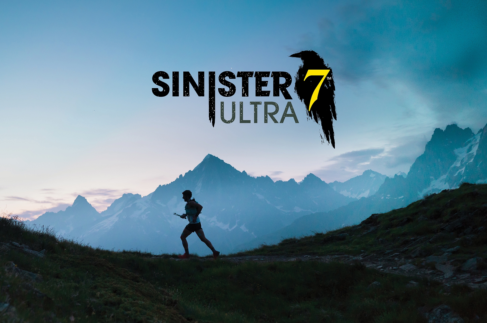
For the 2023 race season we had the privilege to rebrand Sinister 7 Ultra, a long standing Ultra Marathon race. They have a legacy of pushing people to the limit learning more about themselves with 7 long legs of the race in the Crowsnest Pass, Alberta. From a 100 miler, 50 miler, 50k and relay option – it will bring out the grit and determination needed to embark on such a challenge. Ravens have long been a sign of scary and sinister things and in all the years the race has been around a raven has been part of their brand.
LOGO RATIONALE | BOLD RUGGED SIN
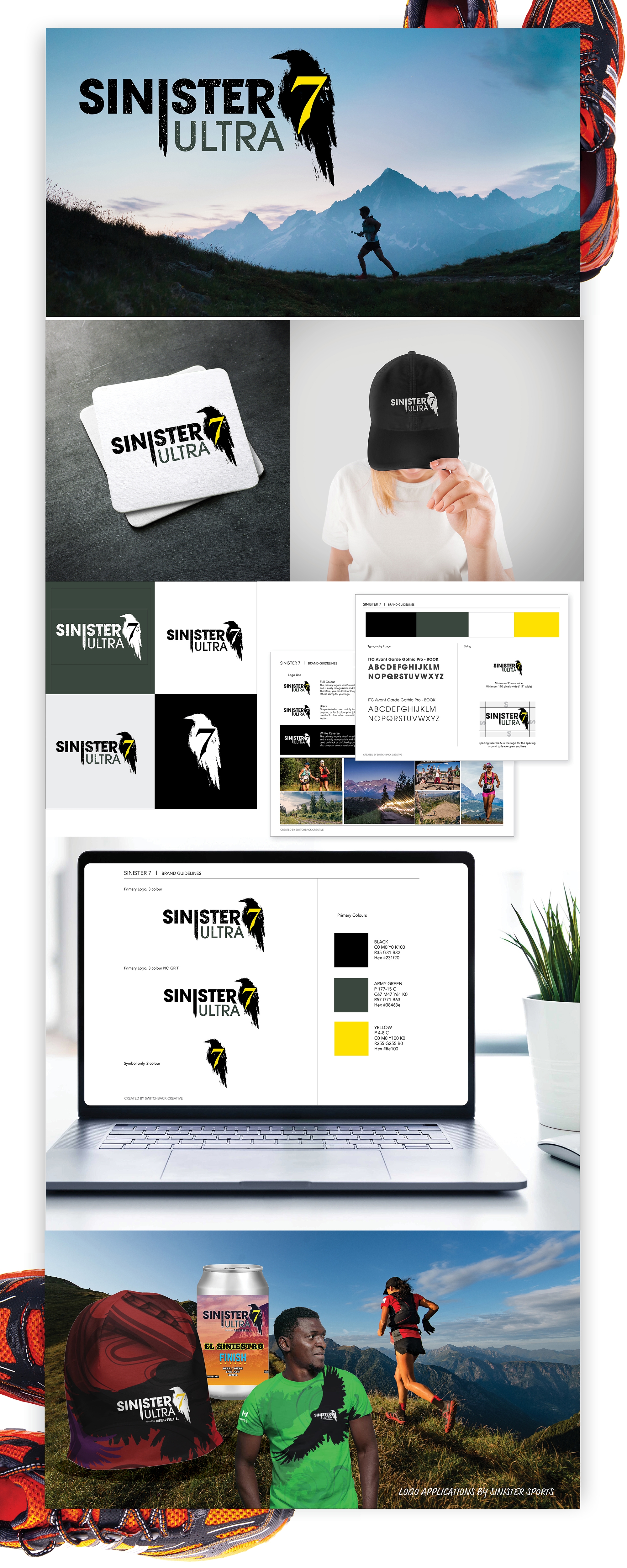
Simple type with the reverse 7 in the watercolour shape of a raven looks rugged, muddy, and similar to a boot print. The grit texture helps set the scene and the extended ‘i’ showcases the SIN aspect of the logo a bit more as well with a brush stroke at the end. The colours are simple bright yellow and dark green. Keeping the 7 from the original logo in the crow harkens back to the original design, and it can be used on its’ own as well.
Keeping the history of the race alive while adding a new spooky stroke to the brand is what we were looking to do. Good luck to all those racing this year and in years to come.

