Kate Daniel Photography, Non-linear Creative Solutions - Branding Development
Visual Identity, Creative Direction, Typography
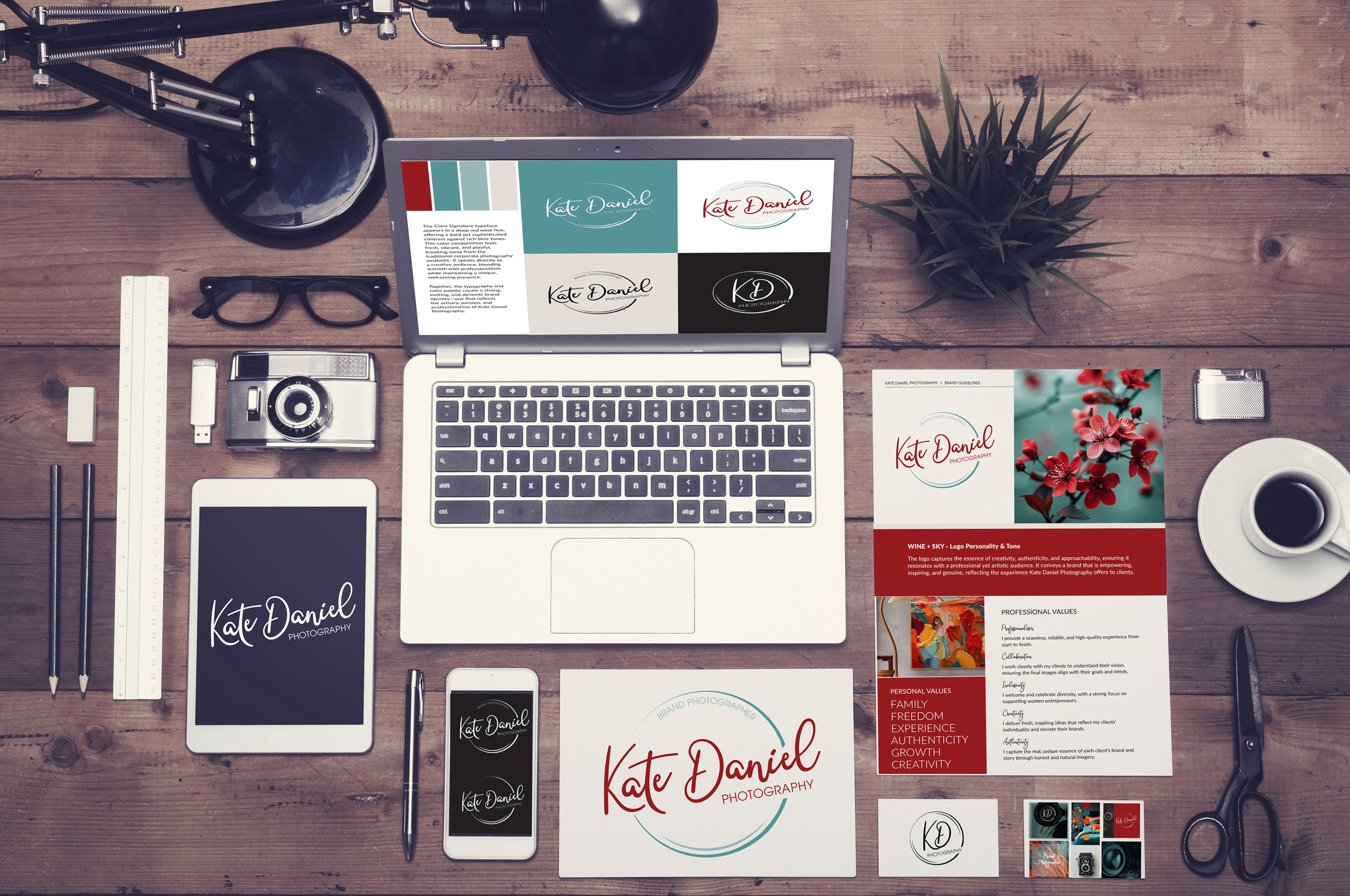
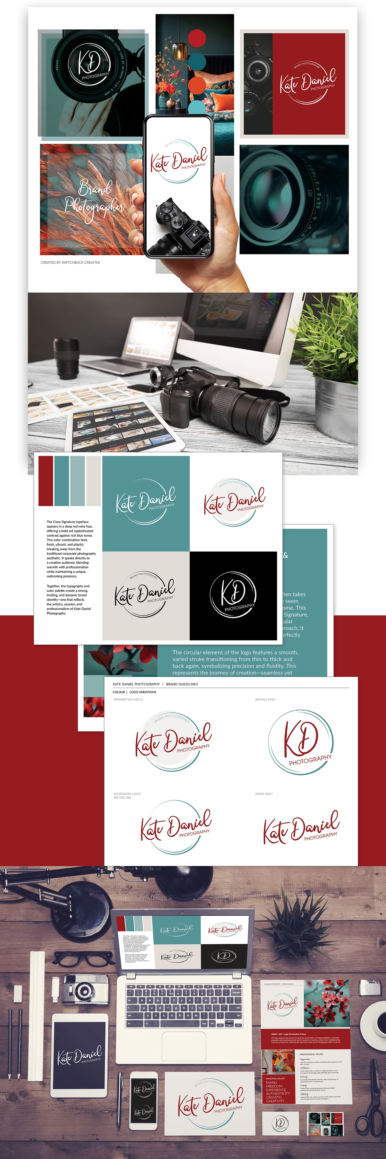
For Kate Daniel Photography, (also a friend and collaborator) we created a brand identity that dances to the rhythm of creativity—free-spirited, a little unexpected, and full of personality.
The heart of the logo lies in the script signature typeface—a handwritten script with charming quirks and irregular strokes. It feels personal, like a note from a friend, and sets the tone for Kate’s warm, authentic, natural style of photography.
We added a swirling circular mark that moves with ease—thin here, bold there—mirroring the beautiful messiness of the creative journey. It’s a nod to the idea that making art isn’t always a straight line… and that’s exactly what makes it magic. The colour palette brings the fun: a bold wine red paired with a rich sky blue. It’s a combo that stands out from the usual soft-and-neutral crowd in photography branding—bold, fresh, and full of confidence.
This identity is all about celebrating creative freedom, thoughtful details, and the joy of doing things your own way. Just like Kate does.
If you want to learn more about Kate Daniel photography, check out her work here.

